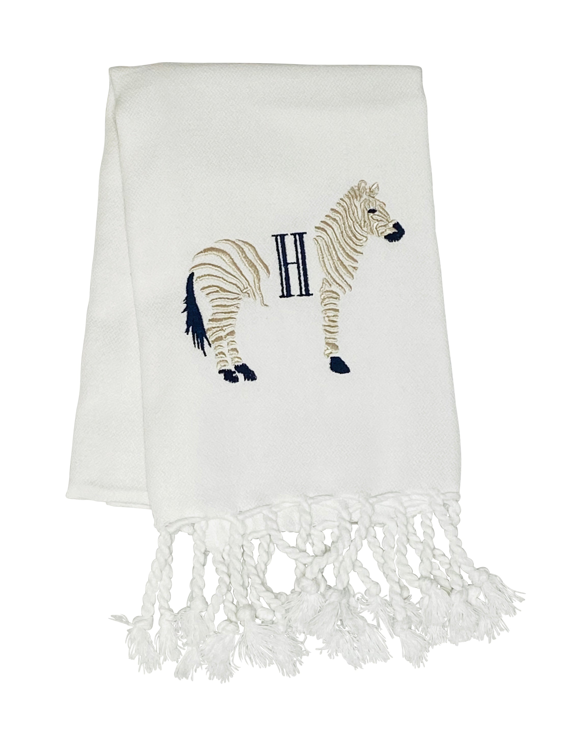
Deciphering Monograms: Understanding the Art of Letter Arrangement
Monograms are a timeless way to personalize items ranging from towels and bed linens to apparel and accessories. At first glance, monograms might seem straightforward – they're just initials, right? However, the art and etiquette of monogramming can be more intricate than most realize. In this article, we’ll explore the proper order for monograms and delve into the occasions when same-size letters should be used.
Monogram Basics
A traditional monogram consists of two or three initials representing a person's name. These initials can be the first, middle, and last name, or just the first and last name. The arrangement and style of these initials can convey a wealth of information, from marital status to personal preferences.
Traditional Monogram Ordering
Three Letters: The most common form of a monogram, the three-letter version, usually features the initial of the individual's last name set larger and centrally, flanked by the initials of the first and middle names. For example, for the name "Jane Elizabeth Doe," the monogram would read "JDE" with the "D" being larger.
Two Letters: When only two initials are used, it's typically the first letters of the first and last names. For "Jane Doe," the monogram would simply be "JD."
Married or Engaged Couples: Traditionally, the woman's first initial is placed on the left, the man's first initial on the right, and their shared surname initial in the center and larger. For instance, if Jane Smith marries John Doe, the monogram would be "JDS."
Same Size Letter Monograms
While the variations above are widely accepted, there are situations where using initials of the same size is both appropriate and stylish:
Single Letter Monograms: Whether it's for simplicity or style, sometimes just a single letter representing the surname is used.
Modern Couples: For couples who don’t share a last name or prefer a more equal representation, using same-size letters is a popular choice. For example, "Jane Smith" and "John Doe" could opt for "JSJD."
Businesses and Brands: Companies often use monograms with equal-sized letters for a balanced, professional look.
Children and Teens: For younger individuals, same-size letters can create a playful, youthful aesthetic.
The Artistic Appeal of Monograms
Beyond the practicality of identification, monograms serve as a form of self-expression. The font, size, and style chosen can reflect one’s personality, style, or the intended use of the monogrammed item. From elegant scripts for wedding gifts to bold, modern fonts for personal stationery, the possibilities are endless.
Conclusion
Whether you're personalizing a gift, branding business items, or just adding a touch of sophistication to everyday items, understanding the nuances of monogramming can make a difference. While there are traditional guidelines to consider, remember that the most important thing is that your monogram feels right for you or the intended recipient. In the world of monograms, there's ample room for both tradition and individuality.


